Mac
Font Smoothing for Non-Retina Display
You can increase the sharpness of the font on your non-Retina display Mac without sacrificing the smoothness with this tip.
Font smoothing can dramatically change how fonts are rendered. You’ll see a notable improvement in the looks and feels of apps by just turning on font smoothing, but with a simple command in Terminal, you can make the font on non-Retina display looks way better than the default setting.
Font smoothing setting is available under System Preferences » General. Turning it off will render the font jaggy and pixelated, so you definitely want to always keep it enabled. It doesn’t mean turning it on makes the text on the screen more readable, in fact, the small text becomes blurry with font smoothing enabled.
This setting used to be more than just a simple on/off switch. In OS X Leopard, we can choose the font smoothing style to match our preferences. The available options are automatic, standard, light, medium, and strong. You can view the difference between each style in this article.
I’ve tried different font smoothing style and find that medium font smoothing style is the best out of available choices. It can smooth text in various sizes, yet maintaining the required crispness for smaller text.
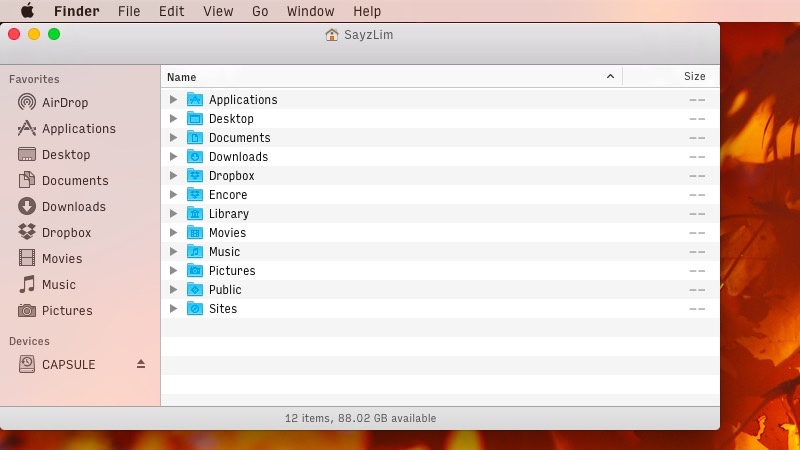
Here is a short experiment.
Open the following screenshot taken with different font smoothing style from off, medium, and strong in new tab. Rotate between tabs and pay attention to sidebar items where the transition is the most apparent. You can see those sidebar items become blurry when rendered with a strong font smoothing style compared to medium font smoothing style.
Changing Font Smoothing Style in Yosemite
Enter the command below in Terminal to change the font smoothing style to medium.
defaults -currentHost write -globalDomain AppleFontSmoothing -int 2
If you’ve changed the value to either 1 (light) or 2 (medium), you’ll notice that the checkbox in the settings becomes a dash. You can also verify the new configuration by entering this command in Terminal.
defaults -currentHost read -globalDomain AppleFontSmoothing
Remember that you need to restart the application to see the change you’ve just made. You’ll notice that the text in the menu bar and sidebar items become sharper compared to the previous setting, which looks blurrier.
Whether you’re on Yosemite with Helvetica Neue, Yosemite with another custom system font, or Mavericks with Lucida Grande, simply changing the font smoothing style can improve how the text are rendered, especially on non-Retina display.
If this was useful, continue through the archive or follow the thread through related notes.