Things I enjoy writing the most are anything related to customization. Browsing the Iconpaper for a new icon replacement, a new theme for Adium, and a gorgeous wallpaper. A desktop can be both useful and beautiful. It’s as easy as writing a blogpost to deliver this message.
Mountain Lion, the latest OS X released by Apple recently, fixes most of the annoyances in Lion and shows the refinement of previous features. There is no major change from the core, but you’ll find number of subtle improvements across the system.
Apple brings Notification Center from iOS to OS X. It’s a good to have feature but not necessarily to live in menu bar.1 To make it worse, there is no way to drag the icon out from menu bar nor an option to hide it.
The old style Terminal can hide the menu item. But when it comes to managing menu bar items, nothing can beat Bartender.
Clean and Clear Menu Bar
Bartender is free during beta and you can buy it for only $7.50 during this period. Considering all the features it brings, Bartender is worth more than that.
A clean menu bar can be achieved easily by using Bartender. I move all the active menu bar items to the Bartender Bar—a secondary menu bar where you can toggle it—and leave FuzzyClock. Finding the menu bar too plain, I add another touch with the help of Delibar menu bar item2.
Bartender is not limited to only show or hide menu items. If you want some menu items to show up when there is an update happen, eg. Dropbox files update, then you can set it to stay in menu bar for a certain amount of time before returning to Bartender Bar.
I use these bullet points to decide which behavior for each menu bar item:
- If it’s not useful, remove it from your Mac. Keep it minimal, understand your needs.
- If it doesn’t do anything nor provide updates, hide it.
- If it provides useful actions and updates, hide it from menu bar, keep it in Bartender Bar. Set it to show up whenever there is an update.
Most of time you don’t need that much items in menu bar. Give it a week without menu bar items. More or less you’ll discover which items is truly important to you.
Sweet Wooden Stack
Stacks has been around since Leopard. It’s a decent feature to browse folders through Dock. I wasn’t a Stacks user until I know there is away to prettify this little feature.3
I love everything made of wood due to their smell and color. Paper Stacks fits perfectly with my partly wooden Dock setup. To have the stack icon the screenshot above, you need to make sure the stack icon is on the top of other items inside the folder. You can easily achieve this by adding a prefix of _ and sort the stacks by name.
Wait a minute… that doesn’t make sense for the Downloads folder. The items inside Downloads folder should always be sorted by added date. Otherwise there is no reason to use Stacks if you can’t see the newest added item.
There is a simple workaround for this problem.
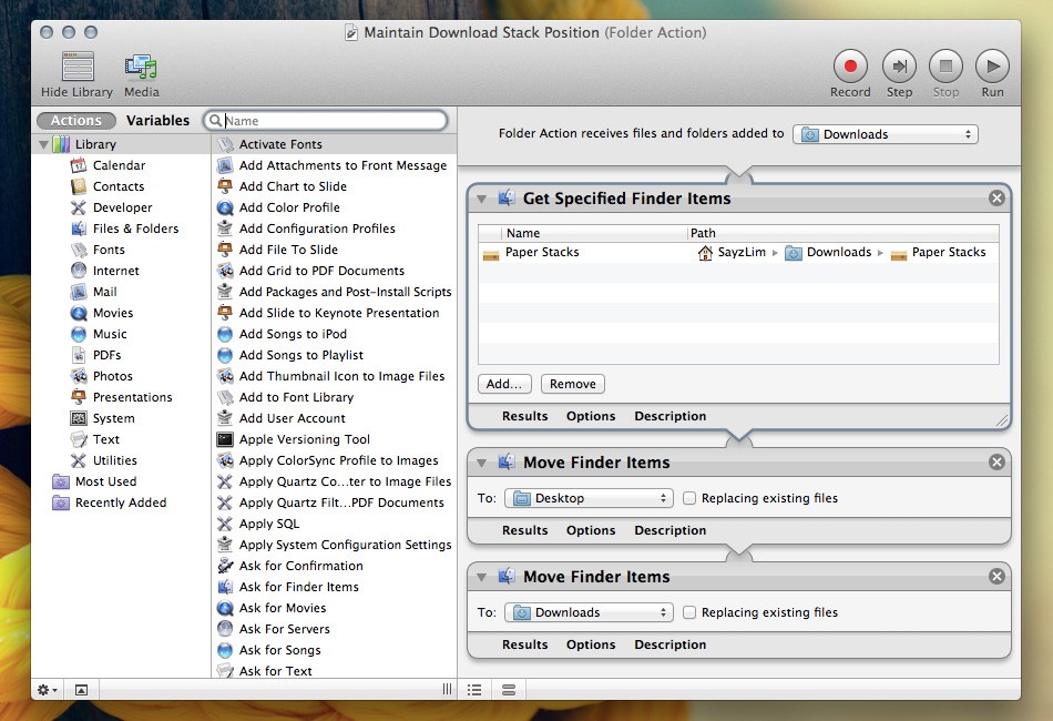
You need to simulate an action that remove the icon and move it back every time an item is added to the Downloads folder. You can write a script to make this happen. Sounds challenging for non-programmer? Luckily Apple has provided regular user with Automator to create simple macros.
The configuration for Automator is fairly simple. The screenshot should explain everything. Make sure you pick the Folder Action when you launch Automator for the first time.
Once everything is configured properly, the Downloads folder should display the stack icon on top of other items.


